

Tai Chi 4 Life
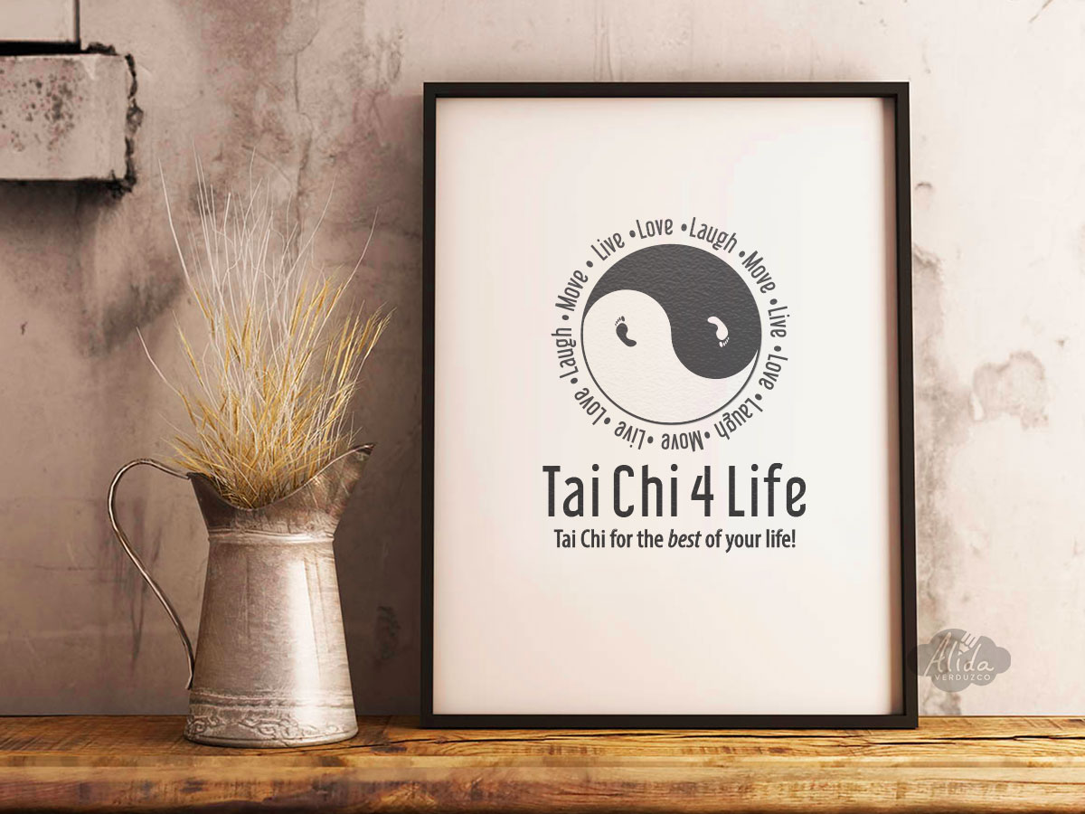
Tai Chi instructor requested a minimalist visual approach to represent the balance and simplicity behind Tai Chi. The yin-yang was given a new spin with feet replacing the usual inner circles, thus bringing immediate attention to the importance of movement and self-awareness championed by the client’s Tai Chi discipline. A grey-scale palette was favored to further channel the idea of peace and quiet. To add light-heartedness and joy to the logo, the client’s motto was entered as repeating text surrounding the yin-yang.
Logo and print marketing materials were created for client, as well as concepts for t-shirts.
- PROJECT TYPES: Logo & Print Design; Marketing Materials
- WORK ENVIRONMENTS: Illustrator, Phothoshop
- VISUAL ELEMENTS: All new logo and stationary design